Tuesday, May 20, 2014

How to turn Analytics data into actionable information 2: segmentation by time and device

Digital marketing is becoming ever more complex; according to the Think with Google multi-screen research

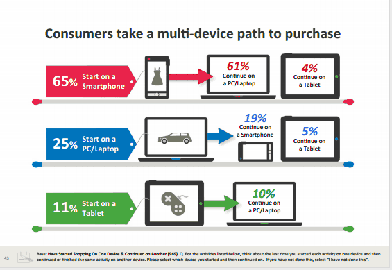
“Today 90% of our media consumption occurs in front of a screen. As consumers balance their time between smartphones, tablets, PCs and televisions, they are learning to use these devices together to achieve their goals. This multi-screen behavior is quickly becoming the norm, and understanding it has become an imperative for businesses.”

We have all the data on earth...

Everyone with at least intermediate knowledge about Analytics and AdWords knows that Google provides almost all the data necessary to be successful in this multi-screen world thanks to Enhanced campaigns. This provides the opportunity to target and bid by device and time segmentation. We also have Analytics report segmentation options for checking the effects and results of our strategy. What’s the issue, then?

The problem is the abundance of options; it is really hard to find the right actionable information among this mass of data. Below I will present a few easy-to-understand Analytics and reporting tips helping you finding order in disorder, or the needle in the haystack if you wish.


How to start?

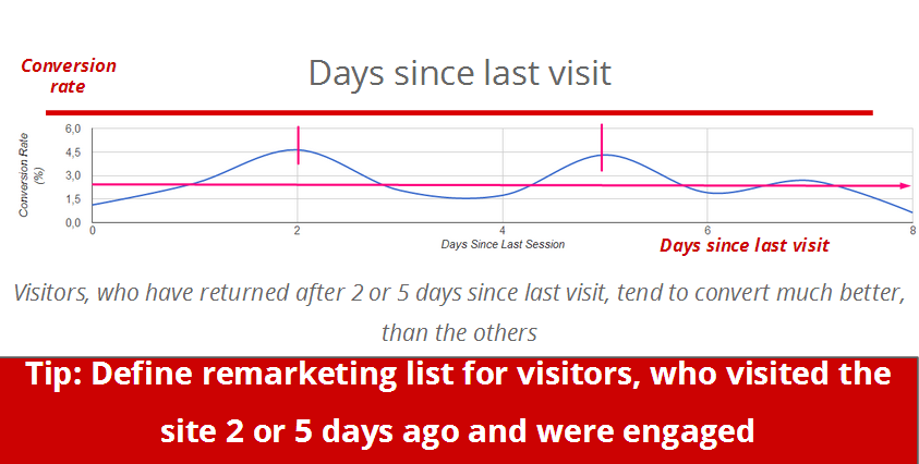
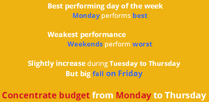
Let's kick off with a simple insight to determine the best performing days of the week and how to set our AdWords bidding strategy to incorporate this piece of information in order to optimize our campaign? To do so let us look at the graph below where the horizontal axis shows the days since last visit data and the vertical axis shows the conversion rate data.


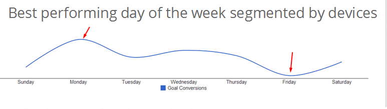
We can immediate deduct obvious and actionable information that can be used in our AdWords strategy:


Segmentation by device and dayparts

Ok now we know which days of the week work best but we have more sophisticated bidding options in AdWords and have much deeper data in Analytics, so let’s try to come up with insights about performance throughout the day:


We defined 4 dayparts to understand the conversion performance: morning, working hours, evening and night. If you look at only the first chart, you will see that evening hours have the most impressive conversion rate, working hours are second and the remaining 2 dayparts do not seem too interesting... On the other hand if one looks at the second chart showing the total share of conversions by number a quite different conclusion emerges. This is a good example how never to judge by one metric only. A single metric without context is always misleading and usually not actionable! It is clear in this example that even though almost 40% of all conversions occur during working hours the other 3 dayparts are resulting in the same amount of conversions and conversion rate.

Dig deeper!

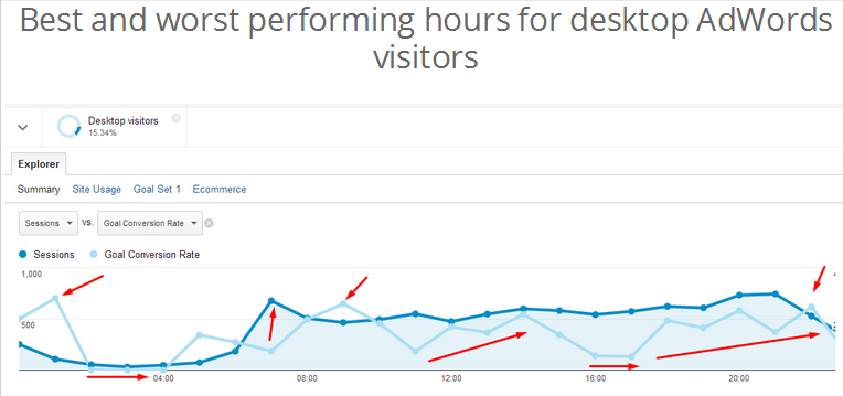
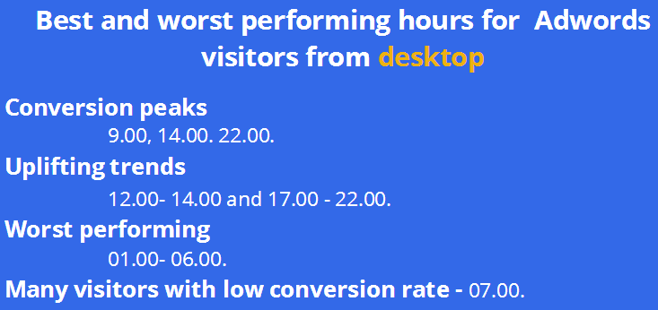
Although these charts are very informative and help us understand the context, they don’t really translate into concrete optimization steps. At this point we are a bit confused and not too sure what to do with our bidding strategy.

To solve the puzzle we have to go even deeper and segment the performance by hour and by device. First we look at desktop visitors from the AdWords campaign and easily identify the top conversion peaks, uplifting trends and worst performing periods, which serve as a perfect input for our enhanced campaign optimization!


Then we do the same for mobile and tablet visitors and a completely different pattern of conversion distribution emerges:


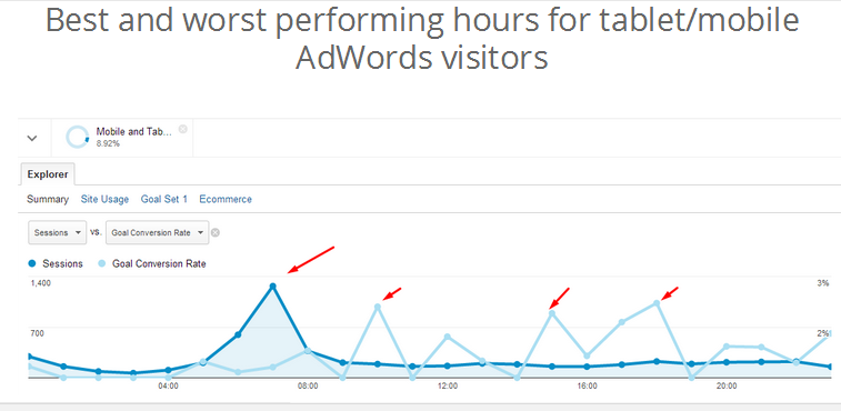
Based upon this info we can schedule our mobile and table AdWords bids optimally.


Conclusion and tips: increase budget and bids during conversion peaks and decrease for low performing periods - especially if your budget is limited and able to get only a small percentage of available impressions.

In the following posts we will continue with more segmentation and analysis tips. Stay tuned!

Loganis was used for data extraction and charting in the examples above. Loganis is a free system that enables one to extract data from Google Analytics and Facebook and share the resulting charts with colleagues and clients. Loganis also allows one to download the data to Excel real-time; an example is shown in a previous post in this blog.

Join the Loganis community free and be part of the innovation!

Thursday, May 15, 2014

How to turn Analytics data into actionable information for AdWords optimization?

Generate business instead of reports

Creative competency is far from being enough to be a good digital marketer. If you want to be a real expert in digital, you have to keep up with Analytics and data mining trends and be an outstanding analyst at the same time. The problem is that extracting data from Analytics is one of the most time consuming part of inbound marketing activities (see to the fresh MOZ survey on the matter) and a great challenge for most digital agencies.
Analytics is the most time consuming job
The issue is that sometimes time, budget or even core competencies and the internal methodology is missing to do a good job and create valuable analysis. If you want to do effective AdWords campaigns you can’t avoid looking behind the scene and allocate large amounts of time for reporting activities. The question is: do you spend this time only with data extraction - find the data, export and merge it, etc. - so are you generating reports, or do you spend your time with real analysis? 

Reporting Squirrels and Analytics Ninjas

My favourite Analytics guru, Avinash Kaushik has a great metaphor for this. According to him you can either be a “Reporting Squirrel”, who spends 75% of his/her time with data production OR you can be an Analytics ninja, who spends 75% of the time with real analysis that delivers actionable insights. There is a huge difference...
Think about it, which one is true for you? If you are providing only single-metric, descriptive reports for your clients with none or few actionable insights and real to-do tips proved by deep analysis, you are a Squirrel... I

A simple example - remarketing list definition by time elapsed since the last session

Remarketing is a really cool functionality of AdWords, but in many cases we are just using a simple list and collect all of the visitors from our site, or define very basic rules, such as visitors who signed up for a newsletter or spent more than 2 minutes on our website. Of course this is still much better than not using remarketing at all, but with one smart report, we can target the most valuable visitors more precisely, those who might be converting with a high chance.  If you have a look at the “Days since last visit” report and see the conversion performance of visitors, a quite obvious insight can be taken home immediately: visitors who return 2 or 5 days after coming to the site convert much better than others! This is a really simple actionable insight for creating a great marketing list for this visitors and boost conversion!

First versus last interaction conversions

Another quick but great insight stems from comparing channels by first and last interaction conversion. Even experienced performance marketers tend to evaluate the conversion performance only by last click conversions although we all know that the typical customer journey is much more complex and conversion path consist of more steps and visits.This attribution modeling option is a really cool functionality in Analytics and provides you the insights you need to see and judge the real conversion value of a given channel. In this chart we can see that the difference between last and first interaction is a positive value in organic and paid search, which means that they seem to be more valuable than they seem judging only by the last click conversion. So we have a hypothesis: the mentioned channels perform better.
To prove the hypothesis we have to double-check the data in the conversion path model. What we see proves our hypothesis, because in most cases even though the last click conversion was credited to a direct visitor, the first click that generated the first visit occurred through an organic or ppc click.
In the following posts we will continue with more deep segmentation and analysis. Stay tuned!

Loganis.com was used for data extraction and charting in the examples above. Loganis.com is a free system that enables one to extract data from Google Analytics and Facebook and share the resulting charts with colleagues and clients. Loganis.com also allows one to download the data to Excel real-time, an example is shown in the previous post.

Sunday, May 11, 2014

Excel as a powerful reporting tool for digital marketing

In my previous, opening post I announced the launch of Loganis.com so it may feel like an abrupt change of topic to talk about Excel's role in digital marketing. Still I believe Excel is worth a post being the unsung hero of analysts worldwide, be it market research firms or financial analysts and of course digital analysts/data scientists.

Digital marketing opened up the possibility to get detailed statistics into how the campaign budget is spent and how to spend it better. With Google's acquisition of Urchin Google Analytics (GA) was born; this has spurred an entirely new breed of people into action who were less programmers and more familiar with numbers. More and more people started using GA in the industry looking at a variety of graphs and specialisation occurred: data scientists entered the offices of PPC and digital marketing firms and analytical marketing was born.

Then came services like Loganis that offer a simplified way of looking at, exporting and analysing web data and with them Excel came back into the picture.

Excel is a great tool due to the unparalleled flexibility to process and visualize data. 

Let me give you a real-life example to underline this point. Suppose you want focus your spending on the medium (organic search, ppc, etc.) that performs best. A measure of what good performance is, of course, a bit subjective, assume you are interested in engagement for now and plan to quantify it as sessions with high conversion rates and pages viewed. So what you are interested in is

conversion rate and average number of pageviews per session by medium type.

Wait a second: what about highly engaging mediums that bring in almost no visitors? We need another metric, the raw number of conversions. Our query now consists of 3 metrics and 1 dimension. This looks quite complicated, indeed so much so that it will not be possible to get the numbers out of Analytics via logging into it.

Loganis, on the other hand allows one to harvest the data quickly. One can simply open the Loganis example Excel sheet, and type in the query

{
:met "ch0:ga:visits,ch0:ga:pageviews,ch0:ga:goalCompletionsAll"
:dim "ga:medium"
:per "last_60_days"
}

into the Generic Query tab, press Refresh and get the raw data. Then all is left to get Excel to transform pageview into average pageviews, goal completions into goal completions per visit (i.e. conversion rate) and plot a chart, for example a bubble chart like this one:


The query above looks admittedly daunting for the uninitiated. For those not wanting to learn this language (which is, by the way based on the GA API, see an intro here) there is always the possibility to use one of the pre-defined dashboard templates and copy queries from there.

As this example highlights using Excel and Loganis one can focus on Information instead of data and spend time not on creating reports for customers but gaining actionable insights that reduce wasteful spending in campaigns.

Another exciting feature of Excel is its pivot table functionality which allows one to manipulate complex data on the fly. I will discuss this in the context of multi-dimensional web data analysis in my next post.