Generate business instead of reports
Creative competency is far from being enough to be a good digital marketer. If you want to be a real expert in digital, you have to keep up with Analytics and data mining trends and be an outstanding analyst at the same time. The problem is that extracting data from Analytics is one of the most time consuming part of inbound marketing activities (see to the fresh MOZ survey on the matter) and a great challenge for most digital agencies.

The issue is that sometimes time, budget or even core competencies and the internal methodology is missing to do a good job and create valuable analysis. If you want to do effective AdWords campaigns you can’t avoid looking behind the scene and allocate large amounts of time for reporting activities. The question is: do you spend this time only with data extraction - find the data, export and merge it, etc. - so are you generating reports, or do you spend your time with real analysis?

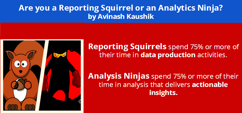
Reporting Squirrels and Analytics Ninjas
My favourite Analytics guru, Avinash Kaushik has a great metaphor for this. According to him you can either be a “Reporting Squirrel”, who spends 75% of his/her time with data production OR you can be an Analytics ninja, who spends 75% of the time with real analysis that delivers actionable insights. There is a huge difference...
Think about it, which one is true for you? If you are providing only single-metric, descriptive reports for your clients with none or few actionable insights and real to-do tips proved by deep analysis, you are a Squirrel...
 I
I
IA simple example - remarketing list definition by time elapsed since the last session
Remarketing is a really cool functionality of AdWords, but in many cases we are just using a simple list and collect all of the visitors from our site, or define very basic rules, such as visitors who signed up for a newsletter or spent more than 2 minutes on our website. Of course this is still much better than not using remarketing at all, but with one smart report, we can target the most valuable visitors more precisely, those who might be converting with a high chance. If you have a look at the “Days since last visit” report and see the conversion performance of visitors, a quite obvious insight can be taken home immediately: visitors who return 2 or 5 days after coming to the site convert much better than others! This is a really simple actionable insight for creating a great marketing list for this visitors and boost conversion!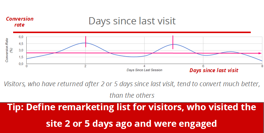
First versus last interaction conversions
Another quick but great insight stems from comparing channels by first and last interaction conversion. Even experienced performance marketers tend to evaluate the conversion performance only by last click conversions although we all know that the typical customer journey is much more complex and conversion path consist of more steps and visits.This attribution modeling option is a really cool functionality in Analytics and provides you the insights you need to see and judge the real conversion value of a given channel. In this chart we can see that the difference between last and first interaction is a positive value in organic and paid search, which means that they seem to be more valuable than they seem judging only by the last click conversion. So we have a hypothesis: the mentioned channels perform better.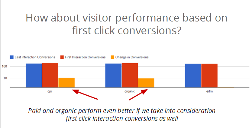
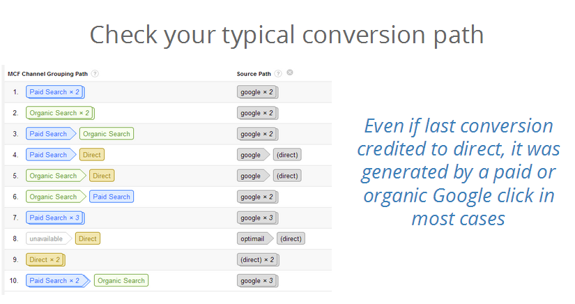
To prove the hypothesis we have to double-check the data in the conversion path model. What we see proves our hypothesis, because in most cases even though the last click conversion was credited to a direct visitor, the first click that generated the first visit occurred through an organic or ppc click.
In the following posts we will continue with more deep segmentation and analysis. Stay tuned!
Loganis.com was used for data extraction and charting in the examples above. Loganis.com is a free system that enables one to extract data from Google Analytics and Facebook and share the resulting charts with colleagues and clients. Loganis.com also allows one to download the data to Excel real-time, an example is shown in the previous post.
