Wednesday, June 4, 2014

Holistic Analytics

Good old days

In the good old days everything was much easier... Before the time of social and mobile marketing, the era of Youtube advertising or remarketing it was simpler to set up goals and achieve them. Our goals were much less complex as all we wanted is more clicks or better position and lower cpc. If we were very innovative we tried to get more conversions with a lower cost. We had been living in a siloed data world, where the different marketing tools such as SEO, or PPC or email marketing were treated as stand-alone instruments which hardly correlated with each other.

The job was straightforward and even with limited knowledge or experience one could provide briliant results since most of the competitors were even less knowledgeable... Our reporting methodology adopted to this simplified world and we used mostly one metric KPI-s or basic segmentations to find insights, e.g.: Where are the most visitors coming from? What keyword do they use? Which is the best converting ad? Should I use landing page A or B?
Yes, we had also much more limited resources and tools to extract out insights but the truth is that most of the marketers were not able to ask the right questions. We focused on data, and were able to understand what happened in the past, but very rarely were we able to answer the 2 most important questions:

Why did it happen?
What should I do now, how should I use this information to use in everyday work?
That was the age of innocence in some way as we didn’t know what we didn't know and therefore couldn’t even conceive how simplified this thinking is...

End of the age of innocence

A few years later we began to understand the true complexity of digital marketing. As more and more tools, targeting options and enhanced reporting functionality became available every day we had to handle a large amount of data making our life far more difficult than before.
To understand the difference just think about your own behaviour as a customer: before a shopping decision how do we perform research and how many stages do we go through before conversion?

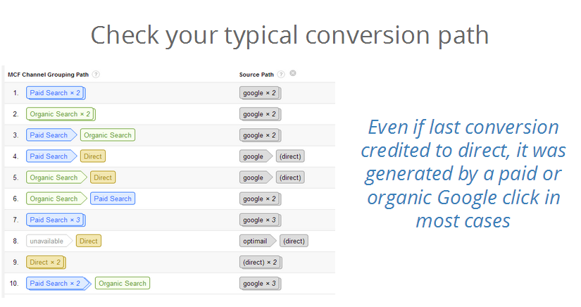
To illustrate the point let's have a look at the “typical” conversion path from top conversion path report:


A bit scary... And we haven't even looked at the following questions yet:
  • Which interactions happened from mobile?
  • Which paths brought the highest conversion value?
  • Which campaign, ad, landing page was effective in first interaction and which in the last
It all seems a bit hopeless and overcomplicated... but we have to be able to answer the most important questions at least:
How can I precisely identify my customers, i.e. each stage of the conversion funnel, and use the appropriate tools to target the right message to the right person at the right time?


And this is EVEN much more difficult than it looks ..

Wrong question - wrong answer

You have heard the saying: garbage in garbage out. What this means is that if the initial question or hypothesis is wrong one can not gain any meaningful information from it (and let’s forget about the bottom-line measurement problems, where data is actually not accurate in the system, because this is a topic of another post).

As marketers you may not know at all which metrics are available in Analytics, Adwords or Facebook Insight but if you can’t ask the right questions there is no analytical marketing or data science expert who can provide you the right answers...

How to ask the right question? Depends on what is your goal!

Do you need more new customer on a low CPA?

  • Concentrate on the new visitors and analyse the top converting visitors’ behaviour by segments that makes sense - time, device, medium landing page, ad, targeting, etc..
  • Try to understand where is the gap: you target the wrong people or use the wrong message or can’t engage them with the content or is there a huge abandonment at the end of the shopping process?

Do you have enough customer but need to increase the average order value?

  • Explore the characteristics of the best customers and the “savvy” ones..Which parameters are the differ from each others? Do they click on different messages? Do they start from different landing pages? Is there any common segments by device? Do people spend more on weekends or working days, morning or evening, etc?
  • Try to set up more hypothesis and test them: e.g. female spend more than male, low-quality smart phone visitors bounce, or should we focus on the cart abandonment rate, because we lose significant money there and this is easy to fix..

Do you have enough new customers, but customers are not loyal and bounce after the 1-2 purchase?

  • That requires quite a different strategy as the previous ones.You don’t have to persuade them to trust in you, because you already did..That means that you can exclude some of the potential problems (e.g. they can’t navigate the site) but have to look for other ones..
  • Why do they don’t return? Did a new competitor entered the market, who seduced them? Were they satisfied with the product/service or not? Did they have problem with customer care? Do you provide the sufficient information for them about new offers? Is your social marketing engaging and positive, which is able to interact with your customers and fans?
  • And we could continue so on..Don’t hesitate and look for the “perfect” hypothesis, but start to test and DO something.. Based on the above example, if you write on 10 types of similar hypothesis (female/male, new/returning, desktop/mobile converting best, or shopping cart navigation is confusing etc) it’s very easy to prove or refute them with one easy report. If you see any significant deviation in the data you can dig deeper as we showed in the last posts - how to turn data into actionable insight..

Don’t judge too fast

On one hand it is very true that many companies fail because of the strive for perfection..They want to plan at the first stage the ideal model and they mixed up, lost in the details and at the end they don’t do anything...But on the other hand there is also a very typical problem that marketers judge by one metric and conclude false consequences too fast..without attempting to be comprehensive just a few example for it:

Judge only by campaign metrics

Mobile campaign doesn’t work for us, we stopped it, because there was no conversion.
Yes it was true, but they have forgot to test the landing page, which was “not served” on mobile..After fixing this problem mobile campaign resulted very effective..

Judge a tool by poor deployment level

This is very common and could citate many examples, but 2 simple one:
Content network bring no conversion - yes, if you are B2B software company and use one general text ads, with “SMB” keywords targeting solely it won’t..But if you use the advanced targeting methods provided by AdWords and combine it with high-quality visual ads, set-up frequency capping, remarketing and enhanced bidding it will :-)

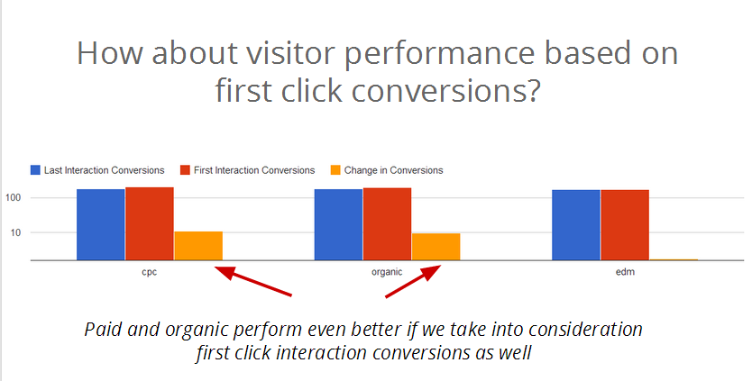
Judge by last click conversion only, instead of analyzing the whole customer journey

Few years ago we have seen only last click conversion, but now we have great reports for checking multichannel conversions and comparing different attribution models. If you see that a general campaign (or social marketing or etc.) perform poor in last click conversion, before you stop have a look at the first-click conversion performance of it..It might serve excellent as first interaction, although after 3-6 visits the final decision is made by a very specific campaign or by direct visitors..

Judge and decide without testing

At last my favourite: we don’t advertise for these keywords, because we are on top places in organic and therefore it’s unnecessary waste of money..
If I ask, whether you have tested it, the answer is no..Without going into details, the fact is, that almost 100% of cases if we advertise for these keywords and are there also in organic AND the paid top positions, our conversion metrics will improve..It results more conversion at a lower conversion cost.

Takeaways


Be aware of the complexity of digital marketing and try to understand your customers as deep as possible
Identify key problems and set up hypotheses for the reasons
Test basic hypothesis and look for significant deviation, if you find one dig deeper, look for the “why” and the “what to do now” instead of the simple what

Never forget about your goals:

  • Try to understand your customers as deep as possible - send the right message, to the right people, on the right device at the right time
  • Measure marketing effectiveness every stage of the customer lifecycle process and work out the appropriate KPI’s for it
  • Create and develop an integrated marketing strategy
  • The goal of Analytics efforts is to make data actionable and usable in everyday tasks


Loganis is a simple, easy-to-understand yet powerful reporting tool, which was developed by online marketing and professional analytics and data experts. It saves time and money by transforming complex digital marketing data into actionable KPI’s. Take the advantage of our reporting system and focus on business instead of data! You can use our marketing insights template to get the answers you need, all within minutes, or if you prefer you can get you customized, unique dashboards. We can assist your agency to create the best solution for your business. You can export and share the charts or dashboards with your boss or colleagues.

Tuesday, May 20, 2014

How to turn Analytics data into actionable information 2: segmentation by time and device

Digital marketing is becoming ever more complex; according to the Think with Google multi-screen research

“Today 90% of our media consumption occurs in front of a screen. As consumers balance their time between smartphones, tablets, PCs and televisions, they are learning to use these devices together to achieve their goals. This multi-screen behavior is quickly becoming the norm, and understanding it has become an imperative for businesses.”

We have all the data on earth...

Everyone with at least intermediate knowledge about Analytics and AdWords knows that Google provides almost all the data necessary to be successful in this multi-screen world thanks to Enhanced campaigns. This provides the opportunity to target and bid by device and time segmentation. We also have Analytics report segmentation options for checking the effects and results of our strategy. What’s the issue, then?

The problem is the abundance of options; it is really hard to find the right actionable information among this mass of data. Below I will present a few easy-to-understand Analytics and reporting tips helping you finding order in disorder, or the needle in the haystack if you wish.


How to start?

Let's kick off with a simple insight to determine the best performing days of the week and how to set our AdWords bidding strategy to incorporate this piece of information in order to optimize our campaign? To do so let us look at the graph below where the horizontal axis shows the days since last visit data and the vertical axis shows the conversion rate data.


We can immediate deduct obvious and actionable information that can be used in our AdWords strategy:


Segmentation by device and dayparts

Ok now we know which days of the week work best but we have more sophisticated bidding options in AdWords and have much deeper data in Analytics, so let’s try to come up with insights about performance throughout the day:


We defined 4 dayparts to understand the conversion performance: morning, working hours, evening and night. If you look at only the first chart, you will see that evening hours have the most impressive conversion rate, working hours are second and the remaining 2 dayparts do not seem too interesting... On the other hand if one looks at the second chart showing the total share of conversions by number a quite different conclusion emerges. This is a good example how never to judge by one metric only. A single metric without context is always misleading and usually not actionable! It is clear in this example that even though almost 40% of all conversions occur during working hours the other 3 dayparts are resulting in the same amount of conversions and conversion rate.

Dig deeper!

Although these charts are very informative and help us understand the context, they don’t really translate into concrete optimization steps. At this point we are a bit confused and not too sure what to do with our bidding strategy.

To solve the puzzle we have to go even deeper and segment the performance by hour and by device. First we look at desktop visitors from the AdWords campaign and easily identify the top conversion peaks, uplifting trends and worst performing periods, which serve as a perfect input for our enhanced campaign optimization!


Then we do the same for mobile and tablet visitors and a completely different pattern of conversion distribution emerges:


Based upon this info we can schedule our mobile and table AdWords bids optimally.


Conclusion and tips: increase budget and bids during conversion peaks and decrease for low performing periods - especially if your budget is limited and able to get only a small percentage of available impressions.

In the following posts we will continue with more segmentation and analysis tips. Stay tuned!

Loganis was used for data extraction and charting in the examples above. Loganis is a free system that enables one to extract data from Google Analytics and Facebook and share the resulting charts with colleagues and clients. Loganis also allows one to download the data to Excel real-time; an example is shown in a previous post in this blog.

Join the Loganis community free and be part of the innovation!

Thursday, May 15, 2014

How to turn Analytics data into actionable information for AdWords optimization?

Generate business instead of reports

Creative competency is far from being enough to be a good digital marketer. If you want to be a real expert in digital, you have to keep up with Analytics and data mining trends and be an outstanding analyst at the same time. The problem is that extracting data from Analytics is one of the most time consuming part of inbound marketing activities (see to the fresh MOZ survey on the matter) and a great challenge for most digital agencies.
Analytics is the most time consuming job
The issue is that sometimes time, budget or even core competencies and the internal methodology is missing to do a good job and create valuable analysis. If you want to do effective AdWords campaigns you can’t avoid looking behind the scene and allocate large amounts of time for reporting activities. The question is: do you spend this time only with data extraction - find the data, export and merge it, etc. - so are you generating reports, or do you spend your time with real analysis? 

Reporting Squirrels and Analytics Ninjas

My favourite Analytics guru, Avinash Kaushik has a great metaphor for this. According to him you can either be a “Reporting Squirrel”, who spends 75% of his/her time with data production OR you can be an Analytics ninja, who spends 75% of the time with real analysis that delivers actionable insights. There is a huge difference...
Think about it, which one is true for you? If you are providing only single-metric, descriptive reports for your clients with none or few actionable insights and real to-do tips proved by deep analysis, you are a Squirrel... I

A simple example - remarketing list definition by time elapsed since the last session

Remarketing is a really cool functionality of AdWords, but in many cases we are just using a simple list and collect all of the visitors from our site, or define very basic rules, such as visitors who signed up for a newsletter or spent more than 2 minutes on our website. Of course this is still much better than not using remarketing at all, but with one smart report, we can target the most valuable visitors more precisely, those who might be converting with a high chance.  If you have a look at the “Days since last visit” report and see the conversion performance of visitors, a quite obvious insight can be taken home immediately: visitors who return 2 or 5 days after coming to the site convert much better than others! This is a really simple actionable insight for creating a great marketing list for this visitors and boost conversion!

First versus last interaction conversions

Another quick but great insight stems from comparing channels by first and last interaction conversion. Even experienced performance marketers tend to evaluate the conversion performance only by last click conversions although we all know that the typical customer journey is much more complex and conversion path consist of more steps and visits.This attribution modeling option is a really cool functionality in Analytics and provides you the insights you need to see and judge the real conversion value of a given channel. In this chart we can see that the difference between last and first interaction is a positive value in organic and paid search, which means that they seem to be more valuable than they seem judging only by the last click conversion. So we have a hypothesis: the mentioned channels perform better.
To prove the hypothesis we have to double-check the data in the conversion path model. What we see proves our hypothesis, because in most cases even though the last click conversion was credited to a direct visitor, the first click that generated the first visit occurred through an organic or ppc click.
In the following posts we will continue with more deep segmentation and analysis. Stay tuned!

Loganis.com was used for data extraction and charting in the examples above. Loganis.com is a free system that enables one to extract data from Google Analytics and Facebook and share the resulting charts with colleagues and clients. Loganis.com also allows one to download the data to Excel real-time, an example is shown in the previous post.

Sunday, May 11, 2014

Excel as a powerful reporting tool for digital marketing

In my previous, opening post I announced the launch of Loganis.com so it may feel like an abrupt change of topic to talk about Excel's role in digital marketing. Still I believe Excel is worth a post being the unsung hero of analysts worldwide, be it market research firms or financial analysts and of course digital analysts/data scientists.

Digital marketing opened up the possibility to get detailed statistics into how the campaign budget is spent and how to spend it better. With Google's acquisition of Urchin Google Analytics (GA) was born; this has spurred an entirely new breed of people into action who were less programmers and more familiar with numbers. More and more people started using GA in the industry looking at a variety of graphs and specialisation occurred: data scientists entered the offices of PPC and digital marketing firms and analytical marketing was born.

Then came services like Loganis that offer a simplified way of looking at, exporting and analysing web data and with them Excel came back into the picture.

Excel is a great tool due to the unparalleled flexibility to process and visualize data. 

Let me give you a real-life example to underline this point. Suppose you want focus your spending on the medium (organic search, ppc, etc.) that performs best. A measure of what good performance is, of course, a bit subjective, assume you are interested in engagement for now and plan to quantify it as sessions with high conversion rates and pages viewed. So what you are interested in is

conversion rate and average number of pageviews per session by medium type.

Wait a second: what about highly engaging mediums that bring in almost no visitors? We need another metric, the raw number of conversions. Our query now consists of 3 metrics and 1 dimension. This looks quite complicated, indeed so much so that it will not be possible to get the numbers out of Analytics via logging into it.

Loganis, on the other hand allows one to harvest the data quickly. One can simply open the Loganis example Excel sheet, and type in the query

{
:met "ch0:ga:visits,ch0:ga:pageviews,ch0:ga:goalCompletionsAll"
:dim "ga:medium"
:per "last_60_days"
}

into the Generic Query tab, press Refresh and get the raw data. Then all is left to get Excel to transform pageview into average pageviews, goal completions into goal completions per visit (i.e. conversion rate) and plot a chart, for example a bubble chart like this one:


The query above looks admittedly daunting for the uninitiated. For those not wanting to learn this language (which is, by the way based on the GA API, see an intro here) there is always the possibility to use one of the pre-defined dashboard templates and copy queries from there.

As this example highlights using Excel and Loganis one can focus on Information instead of data and spend time not on creating reports for customers but gaining actionable insights that reduce wasteful spending in campaigns.

Another exciting feature of Excel is its pivot table functionality which allows one to manipulate complex data on the fly. I will discuss this in the context of multi-dimensional web data analysis in my next post. 

Wednesday, April 30, 2014

Loganis.com is out!

After 9 months of work since the inception of the idea Loganis.com was finally launched today. This certainly calls for a celebration, however the champagne must wait for a few weeks as part of the team is in Budapest, Hungary while others are in London. Good thing we have cheap airlines and Hangout these days.

Based on our own experiences and those of friends in the PPC business we have realised that PPC specialists and analysts spend most of their time preparing reports for customers and consequently only a small amount of time remains to carry out the review and analysis of the campaign efficiency.

This immediately makes one think of ways of automating reporting or preparing data for human consumption, so we looked around on the web and found quite a few tools. Some of them were good in certain respects: a few could make beautiful diagrams on a handful of metrics, others could export the data to Excel, whereas a couple handled a wide variety of sources of data.

What was missing in all of them is a uniform approach to all web data, a single way to get the data from all the sources, be it Google Analytics or Facebook or Twitter. Web analytics needs a platform that people in finance already have in the form of Bloomberg and Reuters, a kind of gateway to all web data!
Loganis Community Thus the idea behind Loganis.com was born. We brazenly envisaged the creation of a community site that enables everyone interested in web data (Google Analytics, Facebook Insight and the likes) to download it using a single tool and a single "language". Reporting and analysis is now easy; one can use the built-in Loganis dashboard or take the data straight to Excel to transform and visualise it with all the power of the good old spreadsheet.

For the more techie-minded: Loganis.com works much like a proxy that makes accessing and querying web data simple and uniform - independent from the source; you can easily summarise all "engaged" visitors from your various web sites and Facebook pages for example.

Loganis is not a software, it is a service: and in that it is a free one. Why? Because we think people should spend their time analysing data and not struggling to obtain it.
Loganis
We believe data from the web (and also offline sources) is far more interesting and useful than it is given credit to. Big data is a term used often today yet it still needs to deliver any change in the daily life of your data scientist or PPC manager working for a digital marketing agency.

So data scientists (or marketing analysts, programmers, PPC experts) of the world: sign up and start creating queries, dashboards and get the data you crave! Just go to Loganis.com and click on "Sign up".